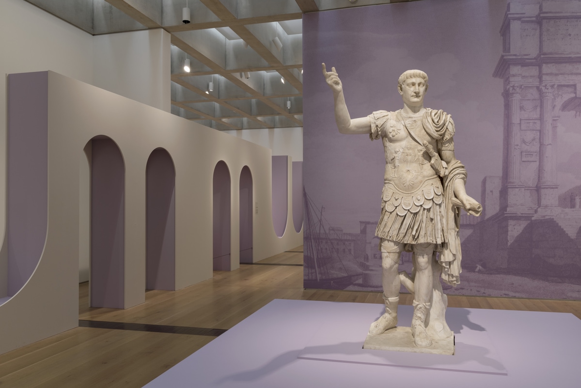
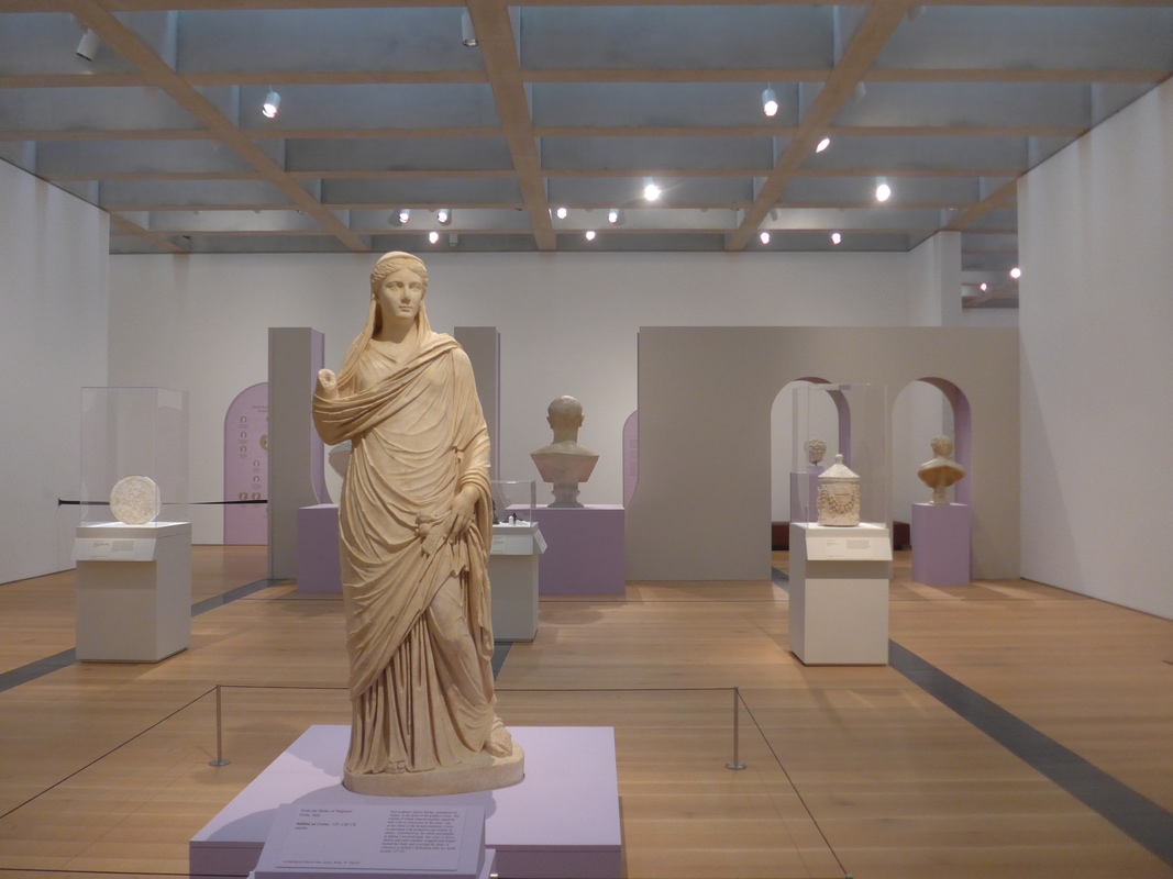
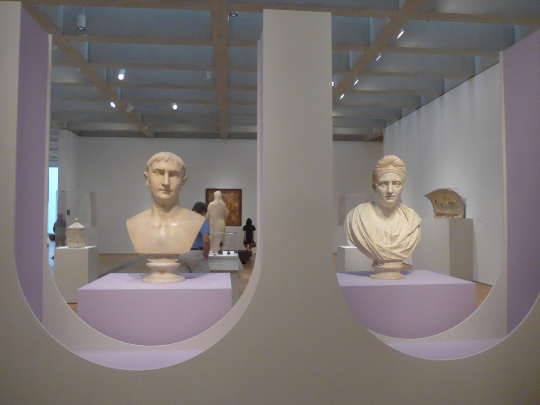
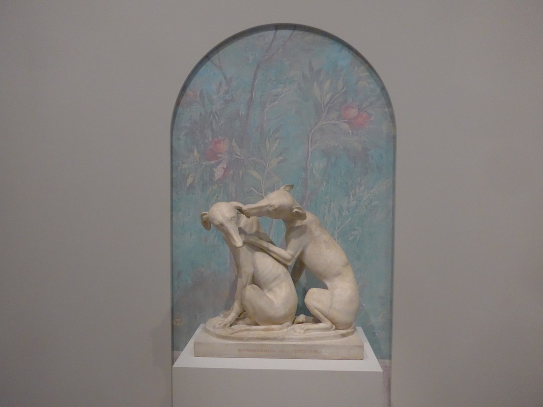
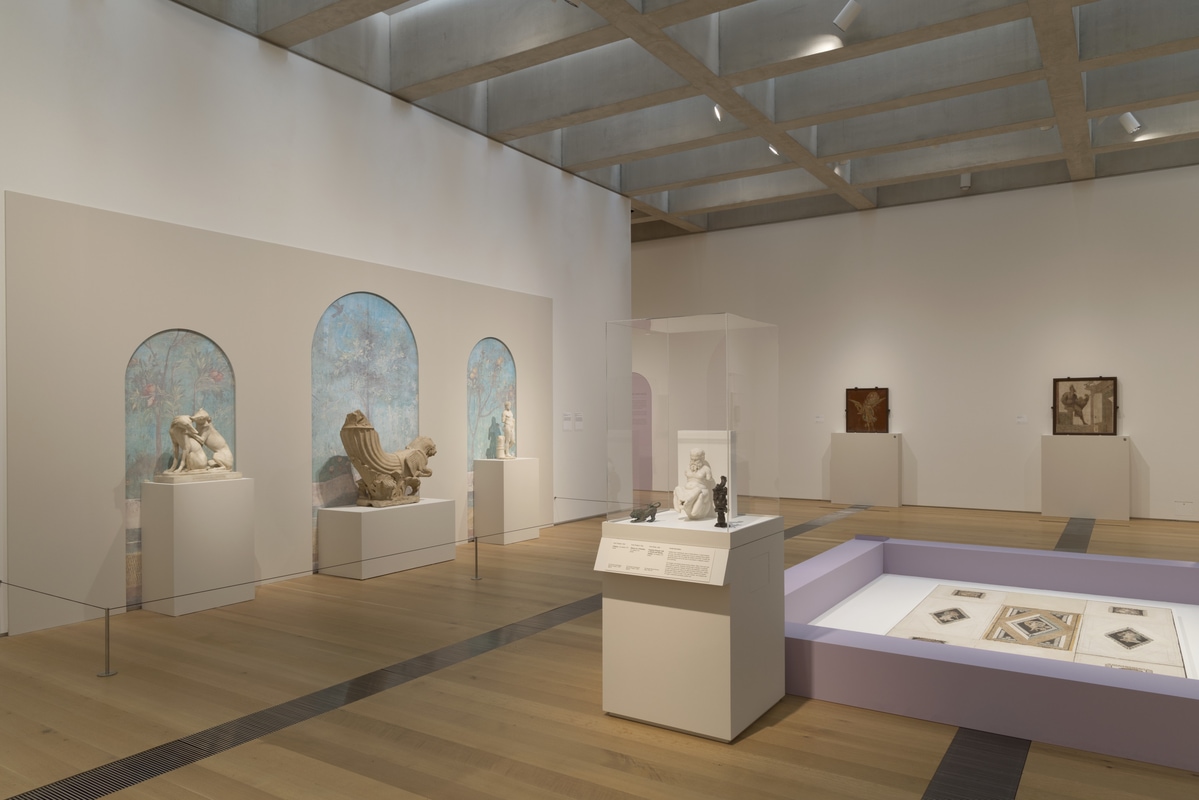
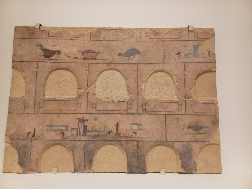
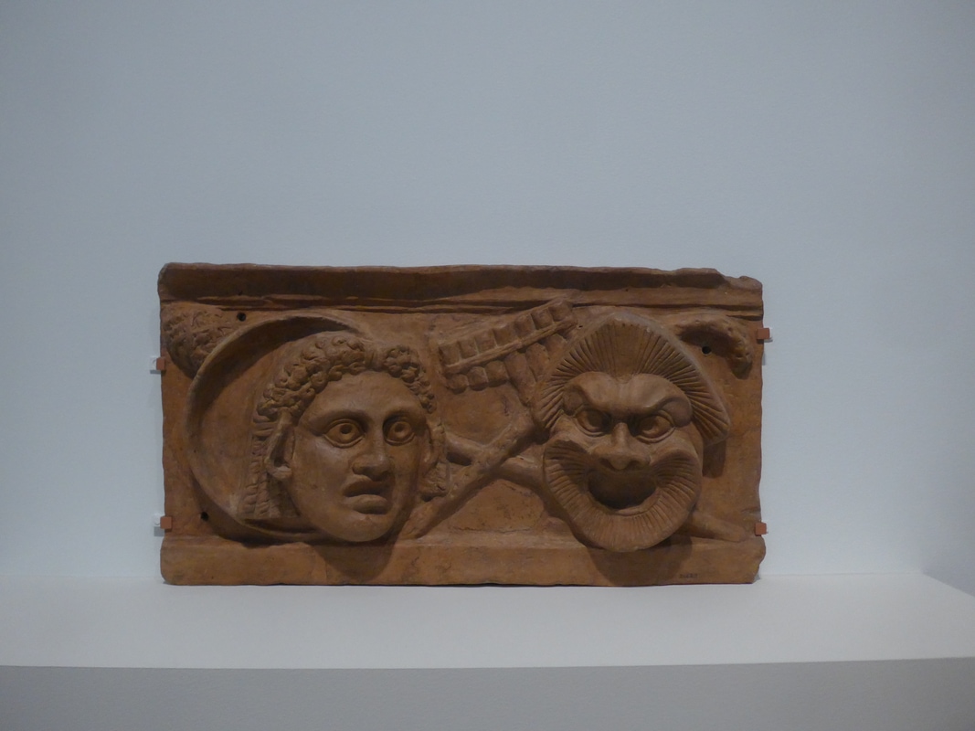
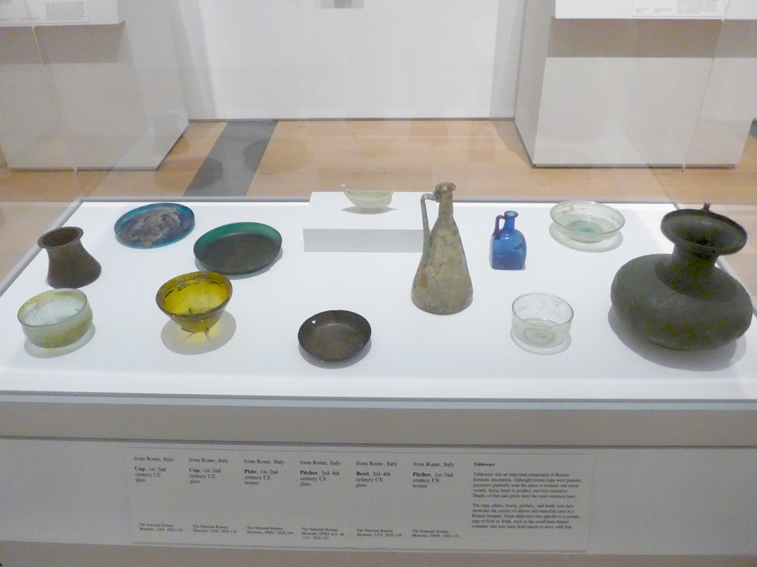
Oh boy, the lighting. But first, the exhibition was really good and I say that as someone who doesn’t wake up every day wondering how I can see more marble statues. Somehow all the objects seemed special and engrossing. It made me wonder if some people are just better at choosing what to put on display than others. Maybe it had to do with the curator being the archaeological curator of the city of Rome, or that many objects had never left Italy before so maybe we’re not used to seeing things of this calibre.
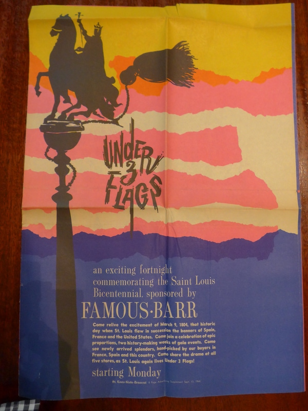
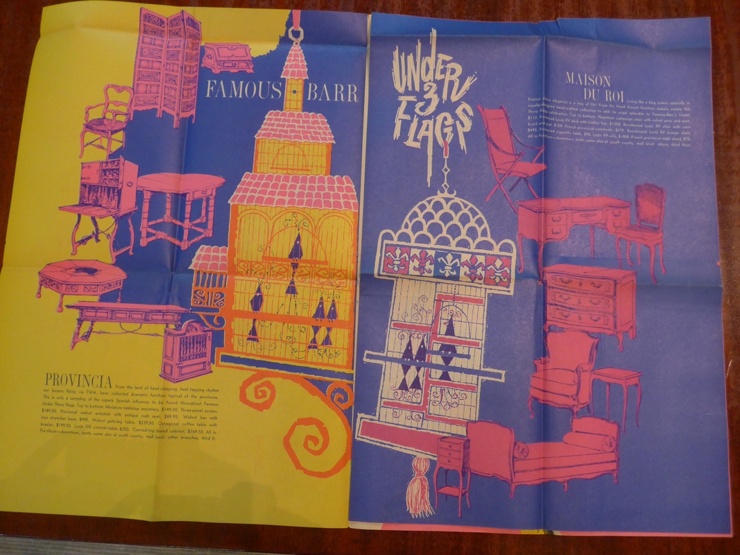
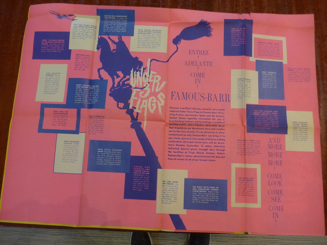
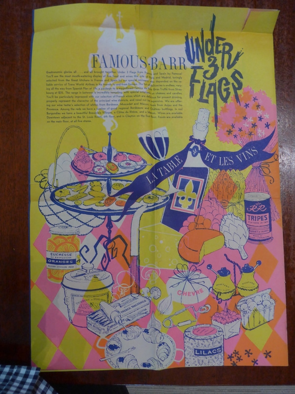
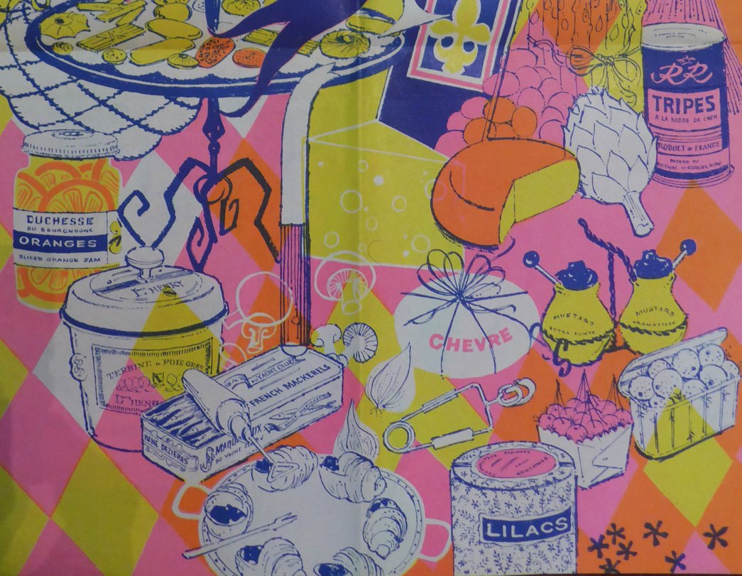
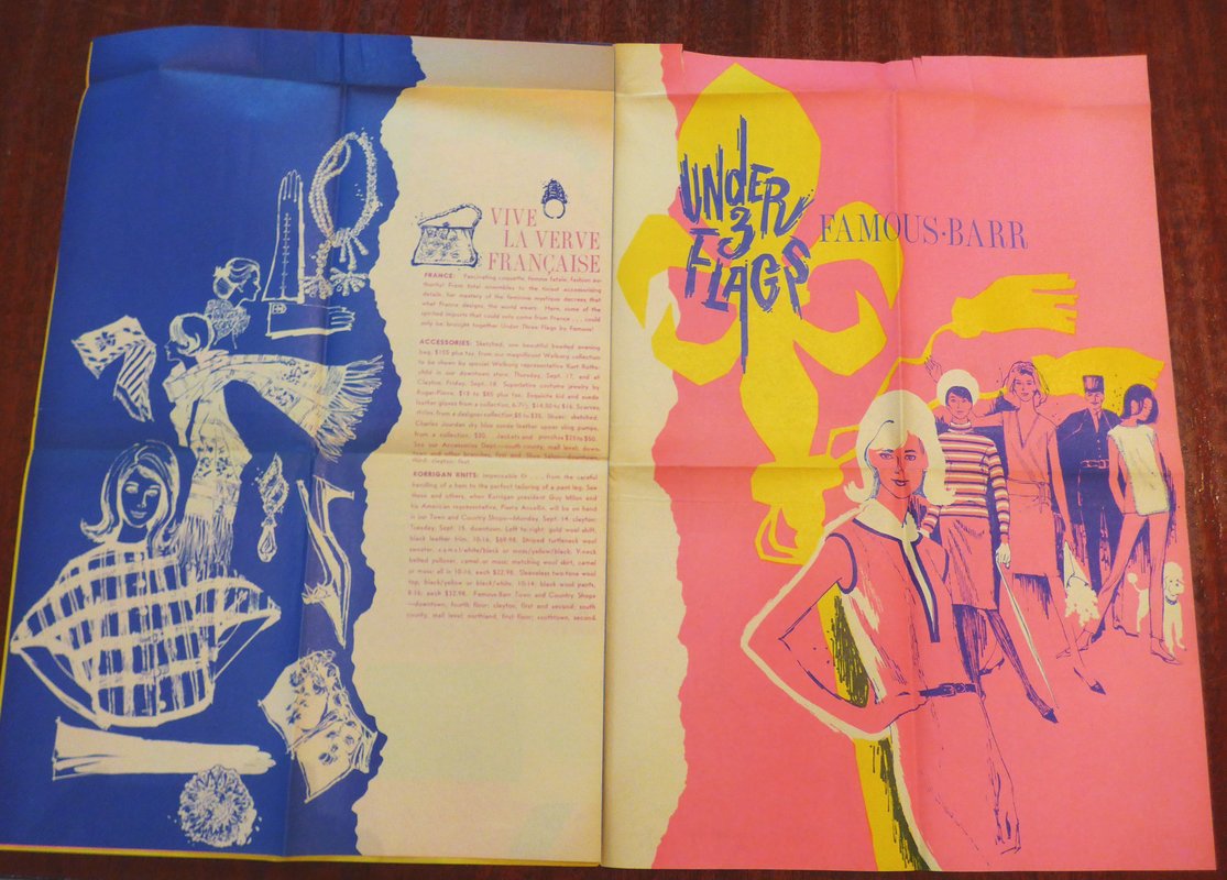
The most fun I’ve had in a long time was at the Missouri Historical Society looking through the archives of long-gone grand department stores which is redundant since they were all grand. These are newspaper inserts from the 1960s advertising annual promotions based on foreign countries accompanied by cultural programs with hundreds of events. In person it’s breathaking how much larger the papers were then and how intense the ink colors were. I have a feeling the inks and/or technology for printing this vivid don’t exist any more or would be so expensive it amounts to the same thing except in fine art printmaking, and yes I spend a lot of my time examining printing inks because someone has to.
“Under Three Flags” celebrated St. Louis’ bicentennial and the day of its founding when the city “flew in succession the banners of Spain, France and the United States”. Merchandise included tripe, escargot, and candied lilacs. Candied lilacs barely exist in France itself any more (I’ve looked).
As always, a personal selection of things you’re unlikely to see anywhere else and none of the greatest hits that you don’t need me to tell you about.
In the major sights nowadays mostly what you see is the back of peoples’ heads such as here at the Musée d’Orsay. It’s getting worse, there’s no end in sight, and no one seems to be doing anything about it. It’s been about ten years since the number of visitors passing through the Louvre’s pyramid entrance starting exceeding double what it was designed to accommodate. They’ve been lowering the daily maximum admissions in recent years but that doesn’t help given that 90% of them are concentrated in the 5% of the galleries that are social media blockbusters (rough numbers) and anyway it’s still double what the Ministry of Culture recommends.
Banner by Toulouse-Lautrec for the traveling show tent of La Goulue, a Moulin Rouge can-can dancer you’ve probably seen in his posters and other works. Goulue is French for “glutton”.
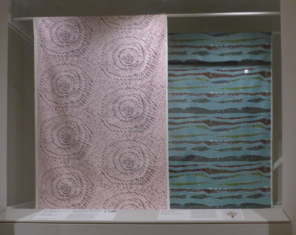
The St. Louis Art Museum only has one small gallery for textiles but its exhibitions are always miniature showstoppers. This one was on commercial fabrics which is a topic you rarely see even in design museums. The focus was on the U.S., U.K. and Italy 1940 to 1970 and it really showed how little flair we have around us nowadays. There’s multiple photos because I really need you to see the patterns as a whole as well as close up so you can see the texture. Otherwise it’s like watching a TV from across the street!
On the left is a pattern from 1954 called Concetto spaziale (Spacial concept) by the artist Lucio Fontana who’s known for distorting and slicing canvases rather than just painting them. The raised texture is an illusion on plain flat cotton printed with an ethereal pastel pink and murky dull eggplant. The design on the right was the winner of a competition in Italy in 1957 that got five thousand submissions.
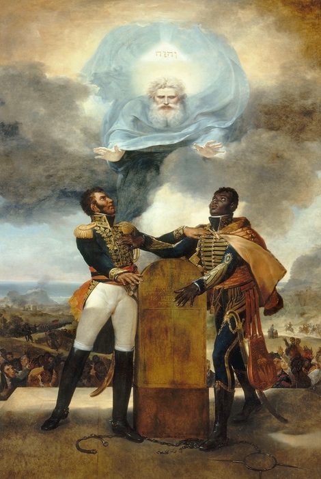
Oy, so much art out there, who has the time? This was a really good exhibition at the Clark in Massachusetts, co-organized with the Louvre, that I highly recommend on a mixed-race artist from Guadeloupe named Guillaume Lethière (1750-1832) who was one of the most successful and prominent painters in Napoleonic France and since then has been almost completely forgotten in except in the Caribbean. They also had a few works by other creoles along with paintings of important creole figures made by white artists in France. This Caribbean-French world should have been the main focus instead of just a minor addition to a Lethière solo exhibition because the fact is he’s just not that good a painter. It would have been plenty to include him as just one among many creole artists.
Yes of course when it’s things you don’t see every day such as the French counterpart of Target, chocolate-scented postage stamps and mail being delivered on stilts! As usual I’m posting pictures of things I’m pretty sure you’re not going see to anywhere else, with one or two exceptions.
I know, the Postal Museum sounds less interesting than watching paint dry –
but trust me it’s riveting and absolutely worth a visit.
They used to deliver mail by dog cart…
and on stilts in marshy areas…
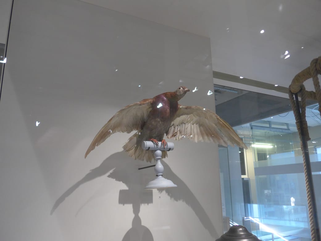
and by pigeons carrying microfilm during the siege of Paris in 1870-1871 during the Franco-Prussian war (one of the actual pigeons and yes actual microfilm like in 1960s spy movies)
Projection of mail from microfilm, 1870-71
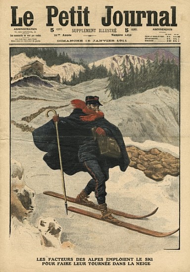
…and by ski
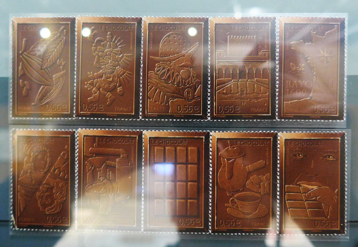
Chocolate-scented stamps celebrating 400 Years of Chocolate (2009). Sorry for the glare. They really need to get anti-refliective glass!
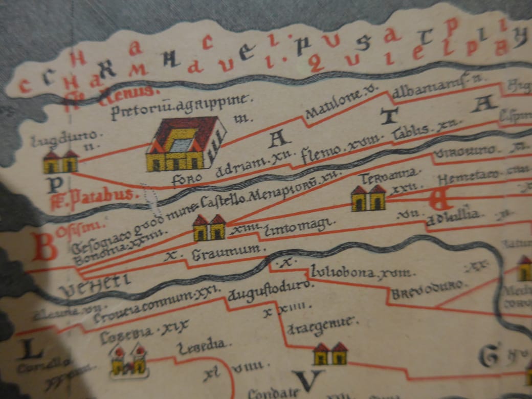
This is a 20-foot long map from 1265 of routes from Bordeaux to India or rather a reprint of it from 1887
“I’m so used to people not knowing about anything but Eloise. That sort of disappoints me.” – Hilary Knight, illustrator of Eloise
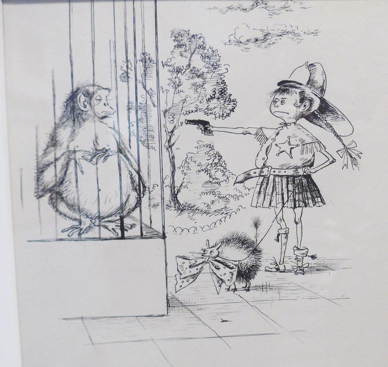
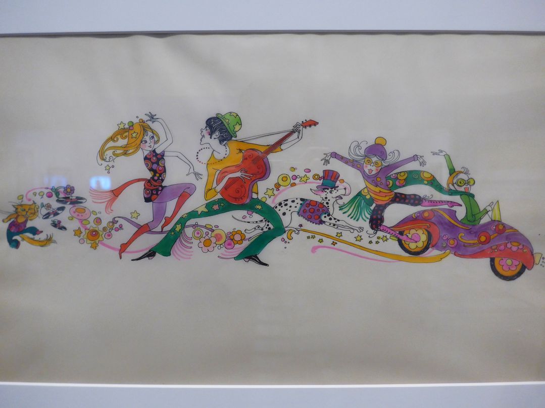
Here’s my collection of seldom-seen illustrations by Hilary Knight, who drew the pictures for the Eloise books and turns out to have had a long career as a brilliant and witty illustrator for magazines, books and posters, along with pictures from the fascinating history and background of Eloise, also seldom seen. Much of his work shares the droll, quirky charm of the Eloise books, making Knight one of our most inspired illustrators.
Some of what’s here I saw at an exhibition at the Normal Rockwell Museum in Massachusetts and had only been published once, ephemerally, such as in long-vanished magazine articles of the 1950s, before completely disappearing from view; others are never-published drafts and other rarities from the exhibition. Still others I dug up myself in online libraries and auction catalogues. Altogether, most of it has never been gathered all in one place.
Also I’ve pulled together the first-ever collection of all the material from the first Eloise book which was published in 1955 but underwent revisions in the 1980s, when it was decided that certain parts that were acceptable for children in the 1950s were now too racy, such as toilets, cannabis and poking fun at Peter Rabbit. As fas as I know the changes have only been mentioned once or twice in print and never all together in one place .
Drawing for Saks Fifth Avenue advertisement c.1971
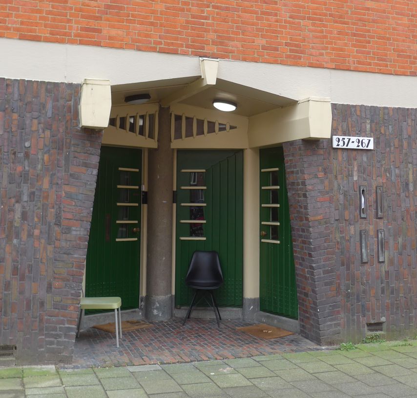
Recently in Amsterdam I trekked out to a semi-remote nondescript residential quarter to visit the world’s first modernist apartment building, built in 1917, which is also one of the most important examples of a gloriously eccentric, little-known and absolutely unique style called the Amsterdam School. Lasting from the late-1910s up to World War II, it combined the austere, spartan functionalism of 1920’s modernisn with Art Deco’s geometric extravagance; Frank Lloyd Wright’s dramatic intersecting planes; and – curve ball! – traditional Indonesian styles; and – another curve ball! – a quirkiness that looks like it could have come from Dr. Suess.
Click on images to enlarge and click again on the edges to jump to next or previous image.
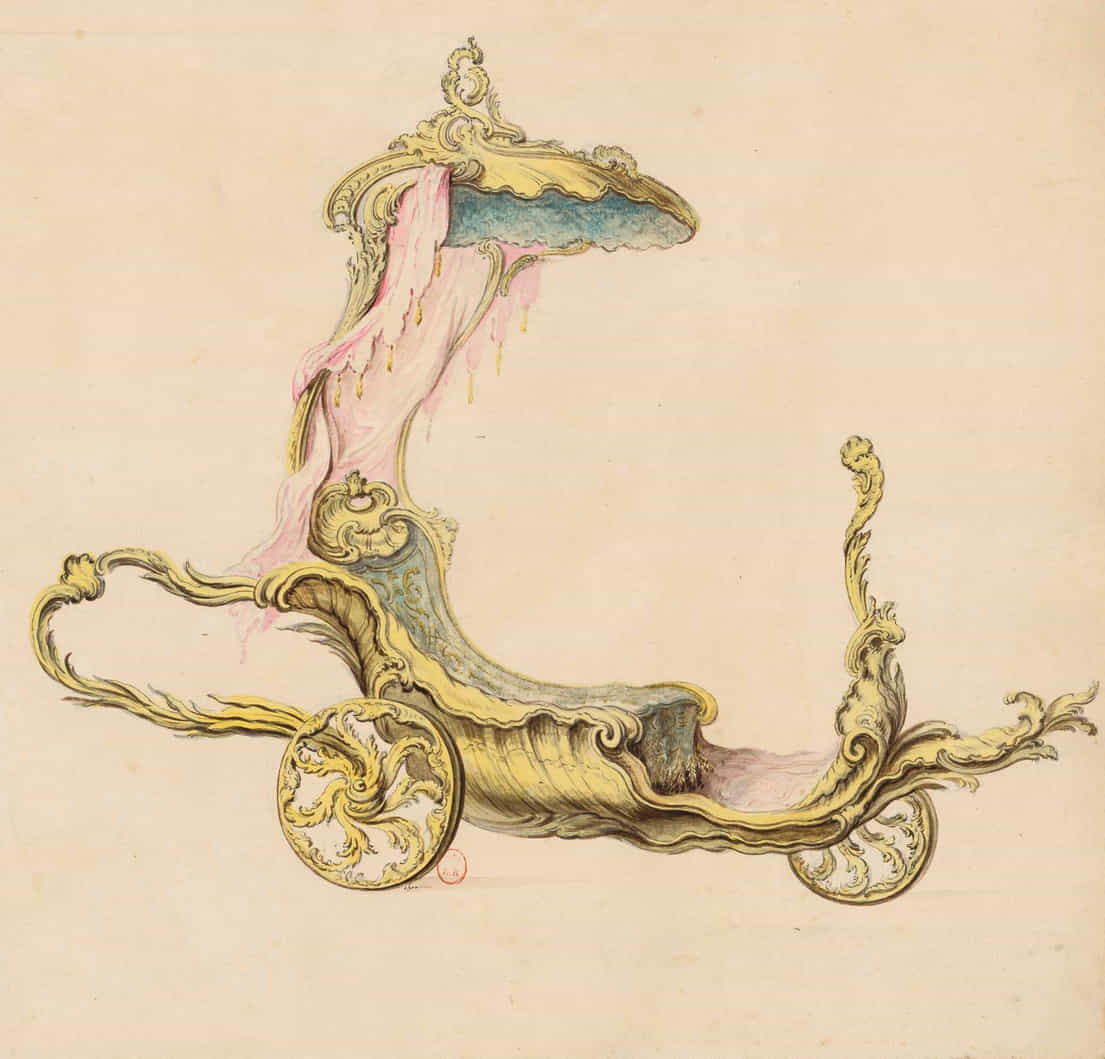
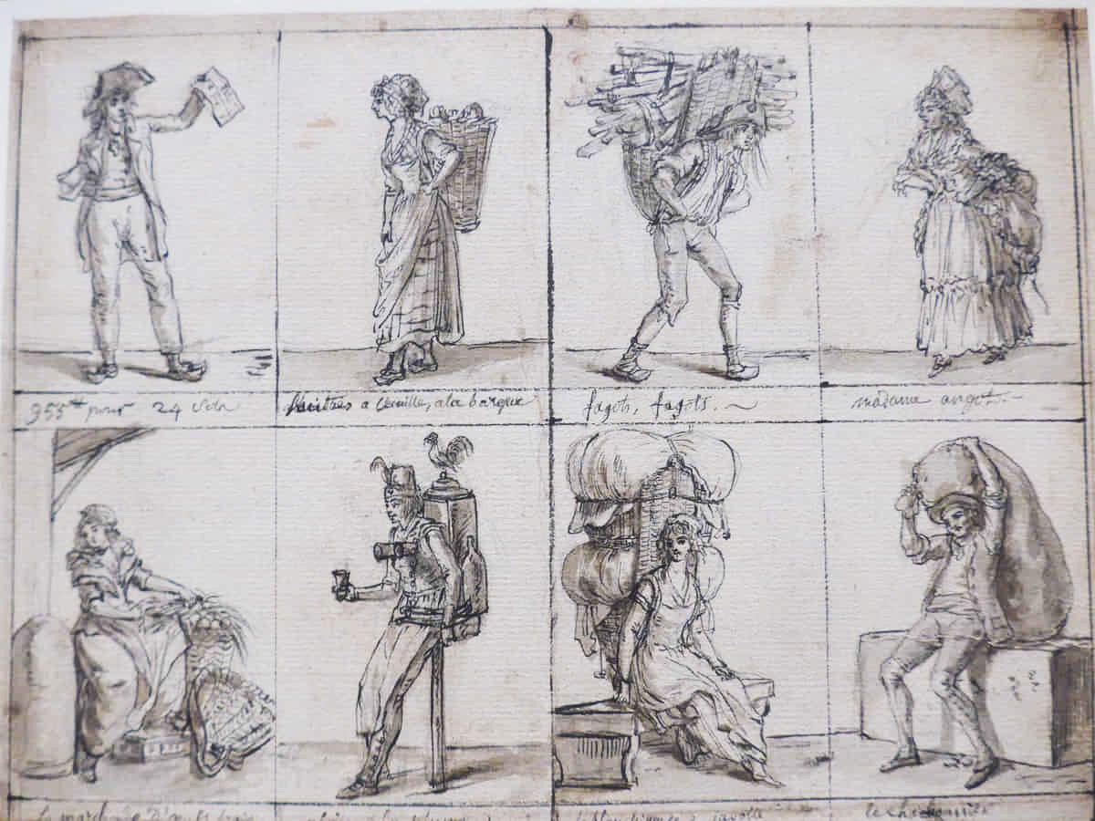
Incredible exhibition of eighteenth-century drawings from the Bibliothèque Nationale de France (French National Library) at the Clark Art Institute in Massachusetts. The point was to show drawings that were made for all sorts of purposes other than just sketches for paintings or to practice drawing human figures, which normally are just about only kind you ever see in museums and the reason why the drawings galleries are the boring ones you always skip (admit it!) This showed how exciting the drawings departments could be.
Above: Design for a toy carriage; shells by Émilie Bonnieu, one of the many women who had lucrative careers producing illustrations of natural specimens; Parisian street vendors with their cries notated Continue reading “Drawings from the French National Library”
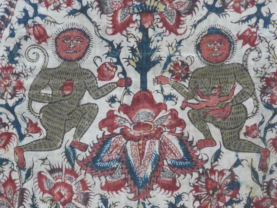
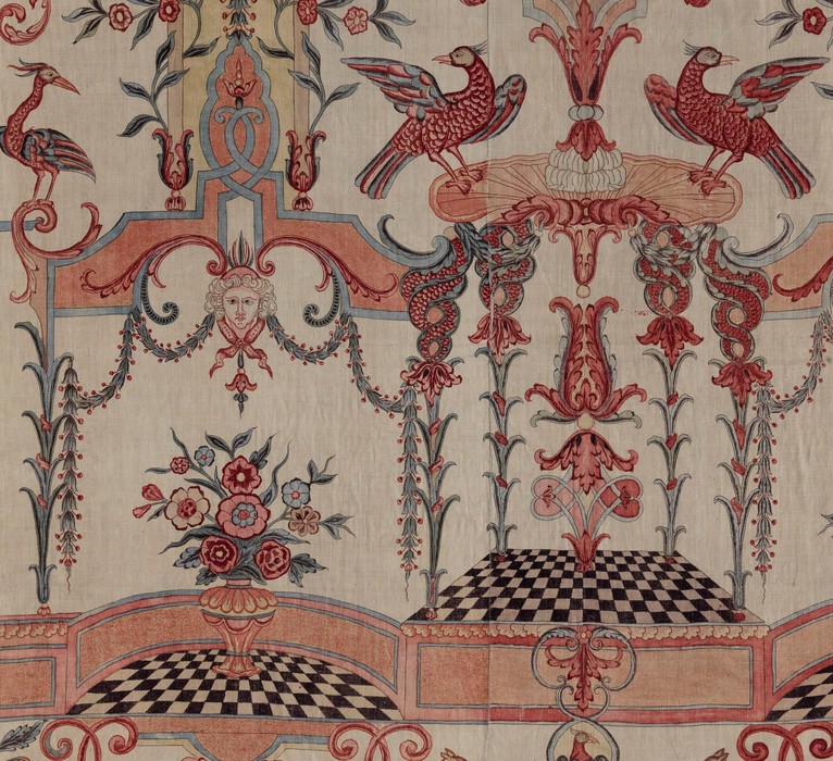
For nearly two millienia, India was the only place where people had figured out how to dye or print in multiple colors on cotton. Before modern industrial chemicals, getting just about any color to stick to cotton textiles – apart from indigo and a couple more – involved complicated, labor-intensive methods and obscure plant extracts that no one else had discovered. As early as 70 A.D., Pliny was marveling in over India’s colored cottons; the British couldn’t dye cotton until they learned India’s methods in the mid-1700s through their colonial trade. Until then, India was more or less the only supplier of colorful printed cottons, or chintz – a Hindi word – not just to Europe but also throughout Asia and they didn’t simply export their own designs but instead tailored them to each region’s local traditions. An exhibition at the St. Louis Art Museum entitled Global Threads: The Art and Fashion of Indian Chintztells the story.
Click to enlarge and page through each set
Chintz made in India c.1875 for the Iranian market