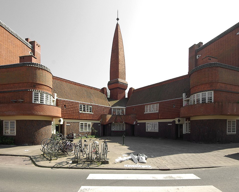
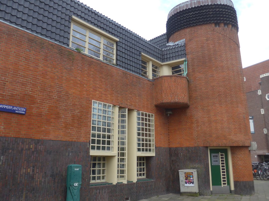
Recently in Amsterdam I trekked out to a semi-remote nondescript residential quarter to visit the world’s first modernist apartment building, built in 1917, which is also one of the most important examples of a gloriously eccentric, little-known and absolutely unique style called the Amsterdam School. Lasting from the late-1910s up to World War II, it combined the austere, spartan functionalism of 1920’s modernisn with Art Deco’s geometric extravagance; Frank Lloyd Wright’s dramatic intersecting planes; and – curve ball! – traditional Indonesian styles; and – another curve ball! – a quirkiness that looks like it could have come from Dr. Suess.
Click on images to enlarge and click again on the edges to jump to next or previous image.


What’s more, nearly all the Amsterdam School buildings were made of brick, a material which was almost never used in modernist architecture outside the Netherlands before the war (Wright being more or less the only prominent exception), and only seldom afterwards. The movement slightly pre-dates the Bauhaus, which at any rate didn’t originate any styles on its own, contrary to popular belief, but rather was the first to bring ongoing innovations together under one roof and integrate them.
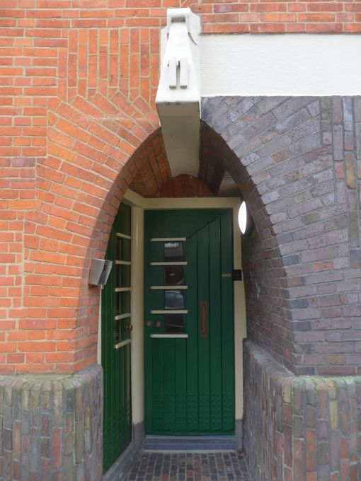
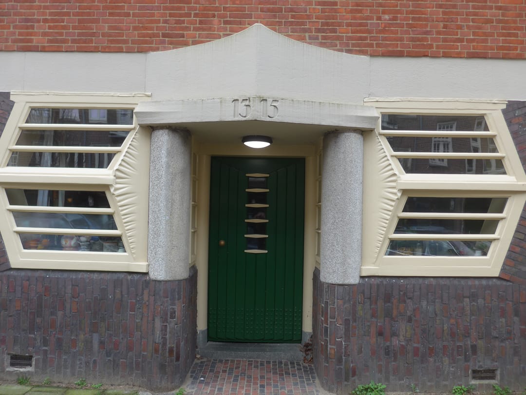
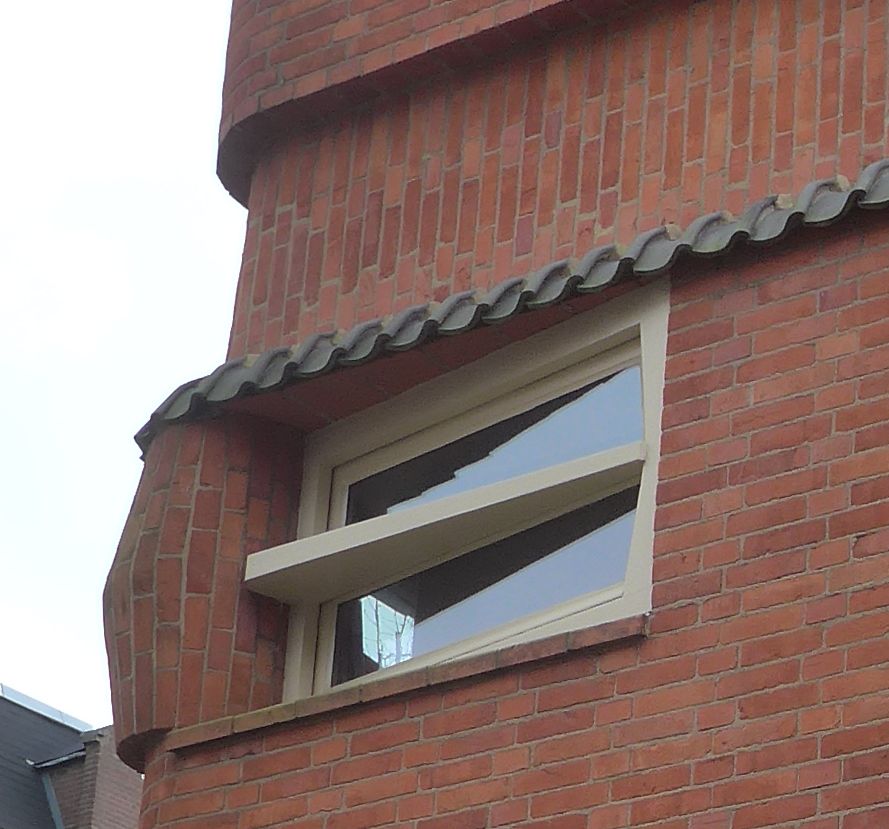
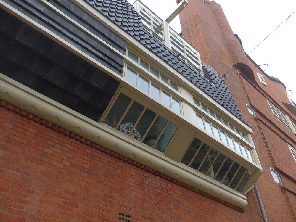
From some angles and in some pictures, the building – designed by Michel de Klerk and called Eigen Haard in the English-speaking world but not in the Netherlands where it’s called Het Schip – looks like a nice enough brick box with a few mildly interesting variations; pleasant and European but nothing exciting or world-shaking. That’s completely wrong. Close up, Het Schip is buzzing with unexpected fanciful twists everywhere you look – odd geometries and endless variations in the shapes of windows, doors, roofs and in bricklaying patterns; profusions of bulging curves, eccentric warps and unheard-of angles. But it never gets gimmicky and somehow the eccentricity comes across as liveable and charming.
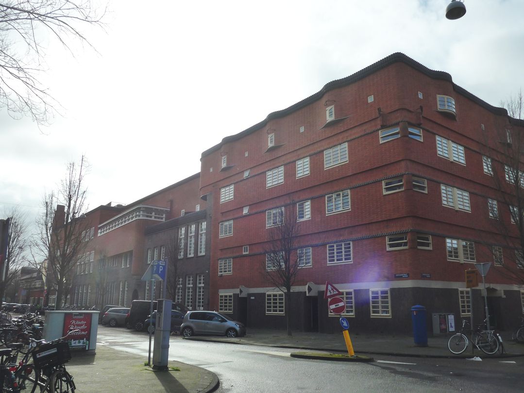
Don’t expect to see much of the Amsterdam School when you visit Amsterdam though, unless you’re prepared to make some detours, to paraphrase the old Michelin guides (“worth a detour” meant the top can’t-miss sights). Like Het Schip, most of the buildings are in residental neighborhoods that lie beyond anywhere visitors go and don’t have the city center’s gorgeous picture-postcard canals or other sights. It may take only 35 minutes to get there but you might need tram then subway then bus so you better be good with complicated transport arrangements. Even specialist books on the Amsterdam School mention only three or four examples in city center, although there are quite a few mildly interesting examples that don’t make it into the books and that you might stumble on if you keep an eye out.
The architect was Michel de Klerk, the most important architect of the Amsterdam School, one of the greatest anywhere in the pre-war era, and a Jew with twenty-four siblings whose father died when he was two and whose mother was a washer-woman. When he was fourteen, the prominent architect Eduard Cuypers recognized his drawing talent and hired him. He designed his first building at twenty-five and died on his thirty-ninth birthday.

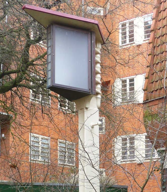
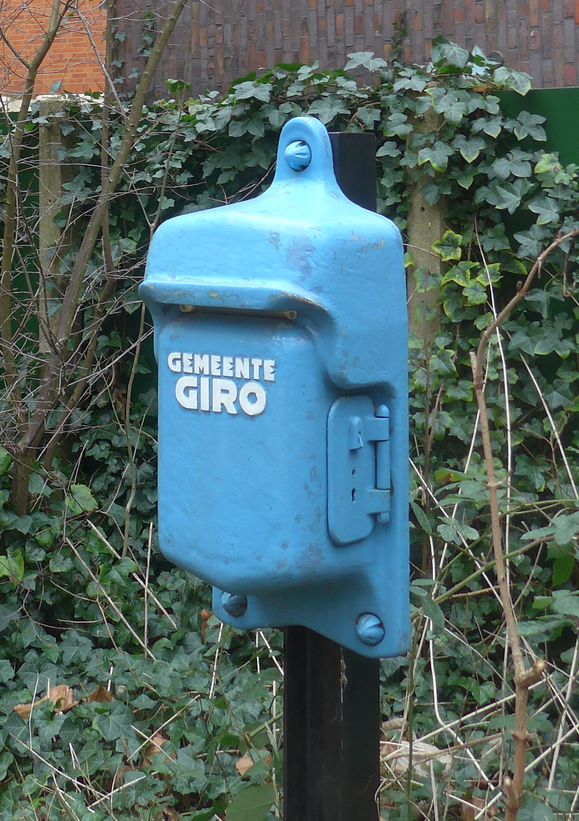
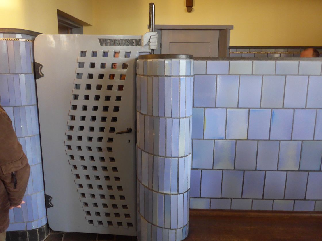
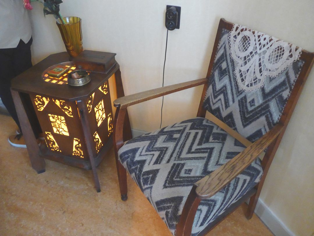
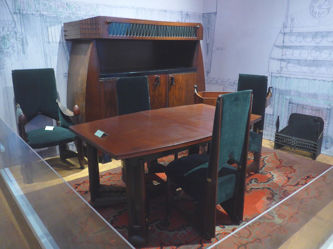
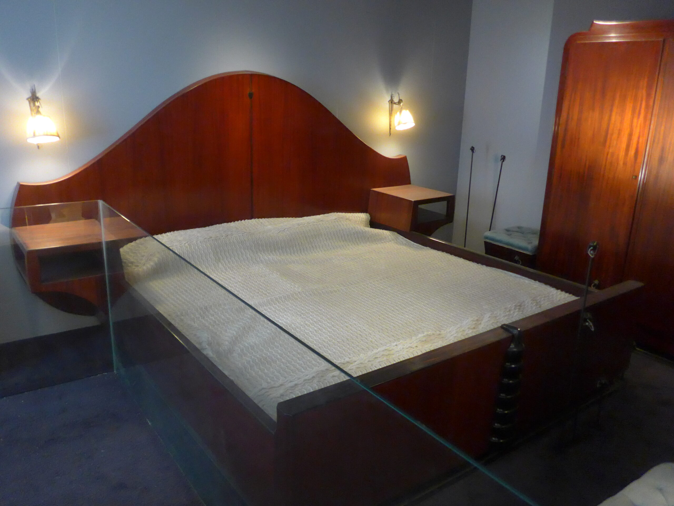
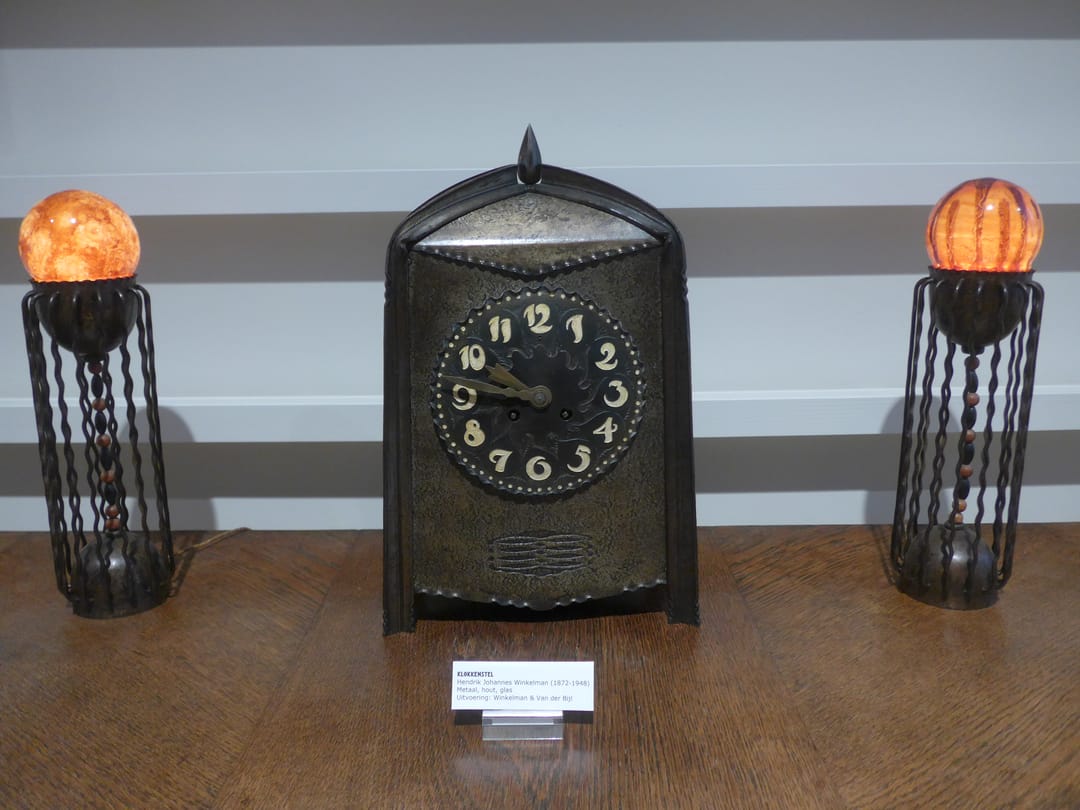
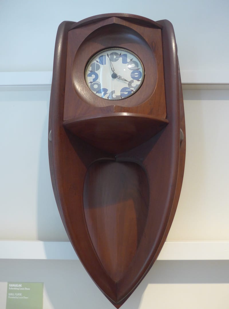
De Klerk designed a profusion of so-called street furniture such as lighting, electrical boxes, a urinal (for public streets but now placed here as a non-funtional historical display), benches and mailboxes, along with furniture. domestic items and graphic design.

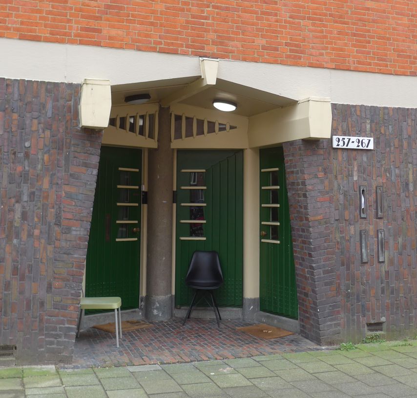
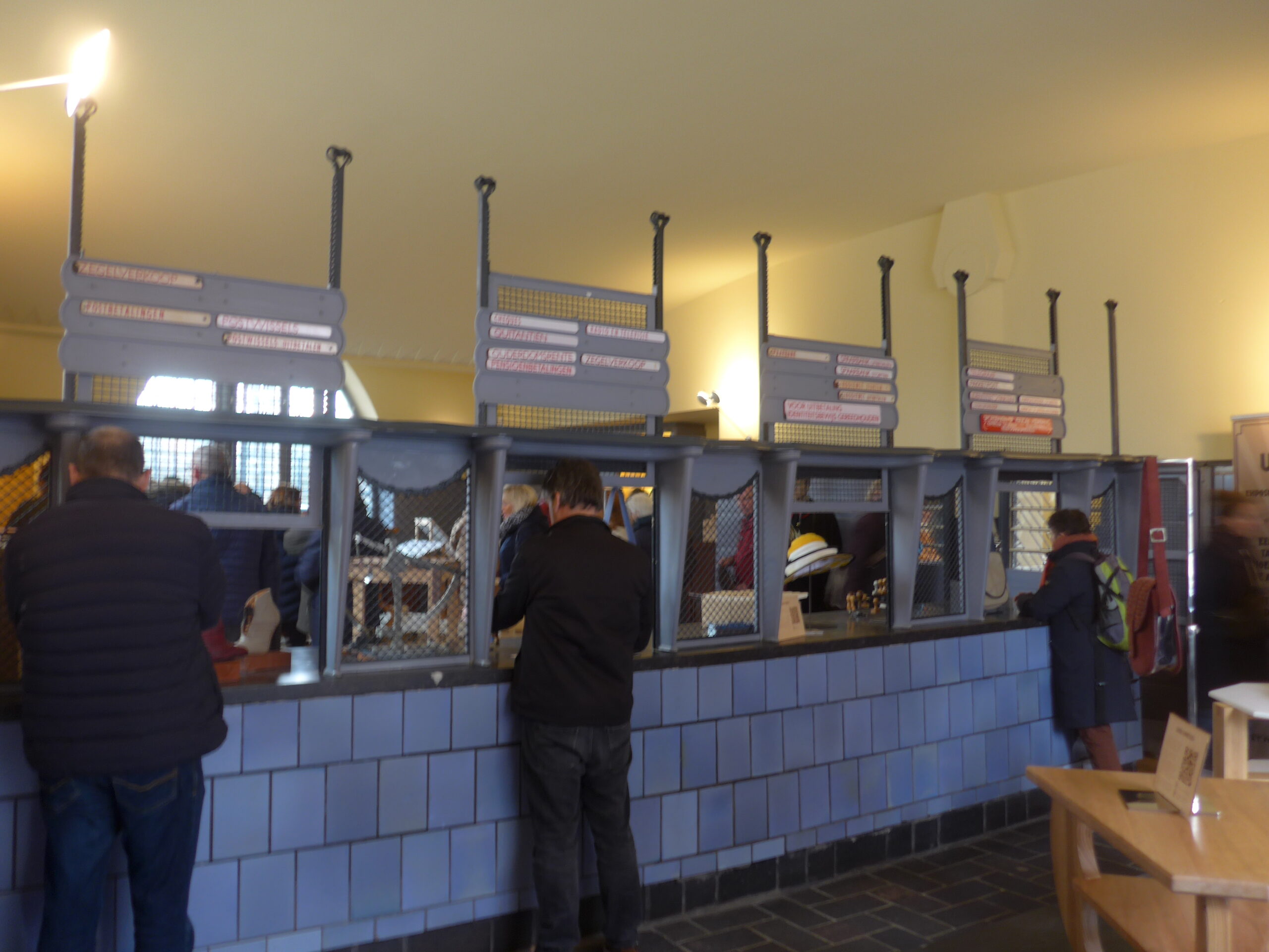
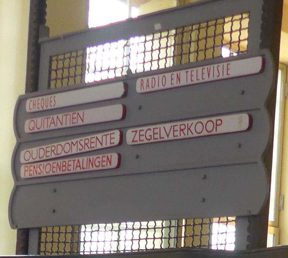
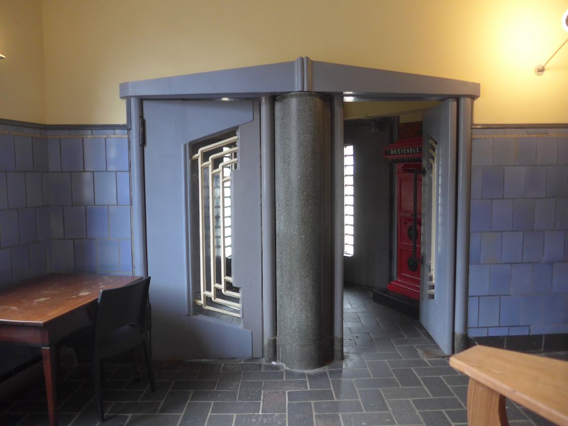
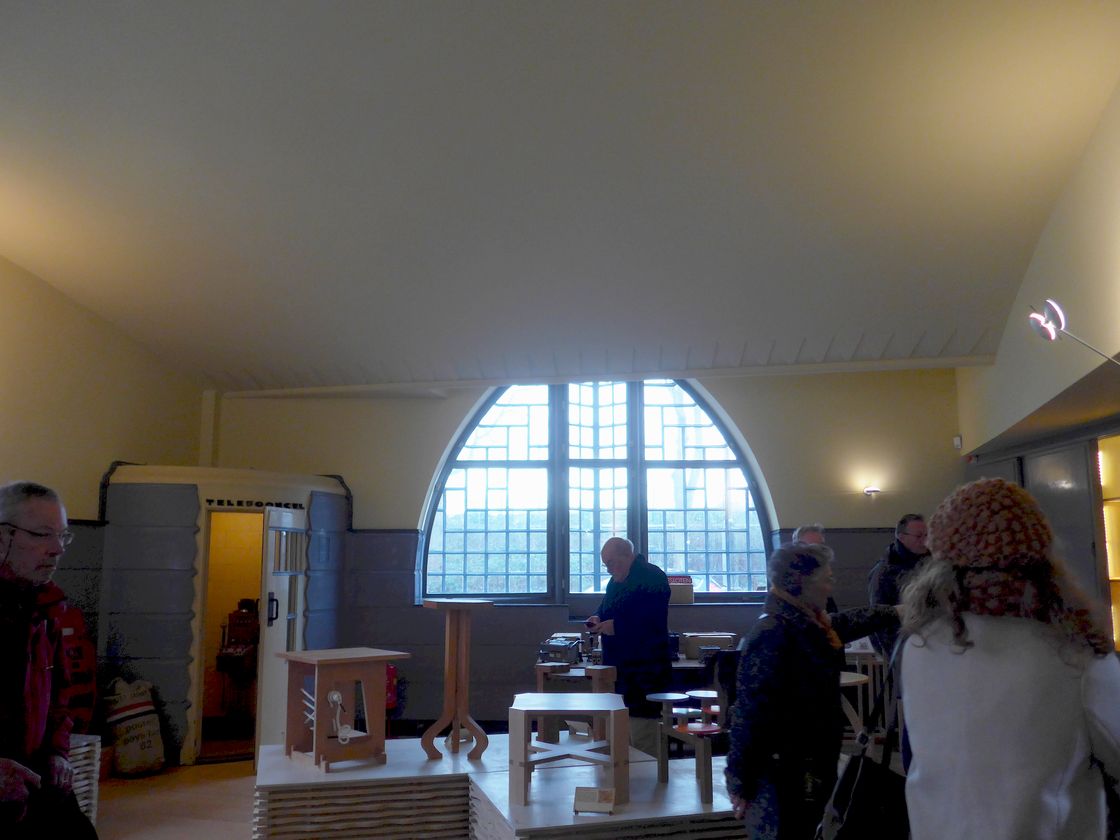
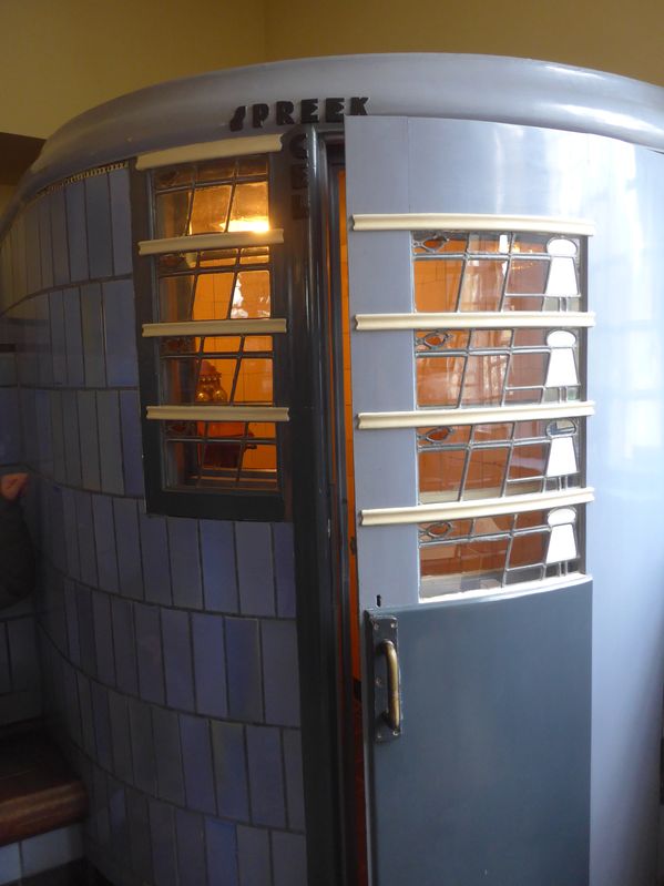
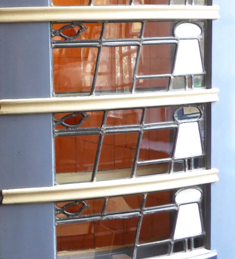
The complex included a post office which is packed with symbolism and references, which De Klerk is known to have used extensively, but he left virtually no documentation about his inspirations. The color is said to be based on that of the carrier pigeon. Zigzags on the ceiling (faintly visible in 1 and 4) may represent a postage stamp’s perforations. The stained glass window of the telephone booth with its curious white shapes (7-9) turns out to depict the glass insulators of telephone cables and birds perching on them. The gate to the back office (6) is labeled Verboden (forbidden, verboten) with a fist holding a policeman’s club.

Het Schip means “the ship” and is a nickname, but it’s the term universally used in the Netherlands for the building. Eigen Haard (“own hearth”) is the worker’s housing cooperative that built it along with many other non-Amsterdam-School buildings. It still exists, operating hundreds of buildings, so calling this one “the Eigen Haard” would make no sense, but the name has stuck in English. (The program of committed socialism is gone though, and it was voted Worst Housing Coop of 2005 by a tenant’s union.)
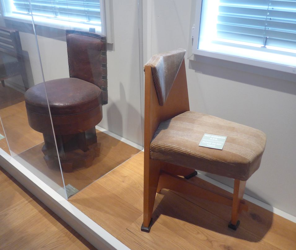
A characteristic of the Amsterdam School is its merging of geometric shapes that were gaining popularity in the 1920s with bizarre curves inspired by the natural world and traditional Indonesian arts, such as in the iron fireplace grate.
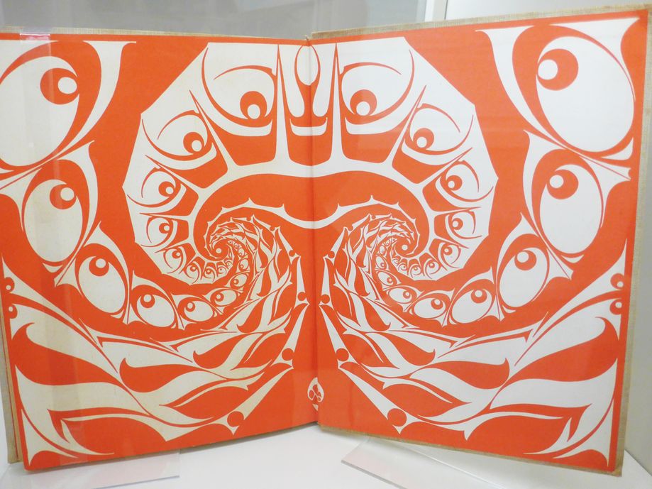
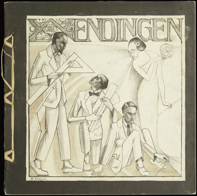
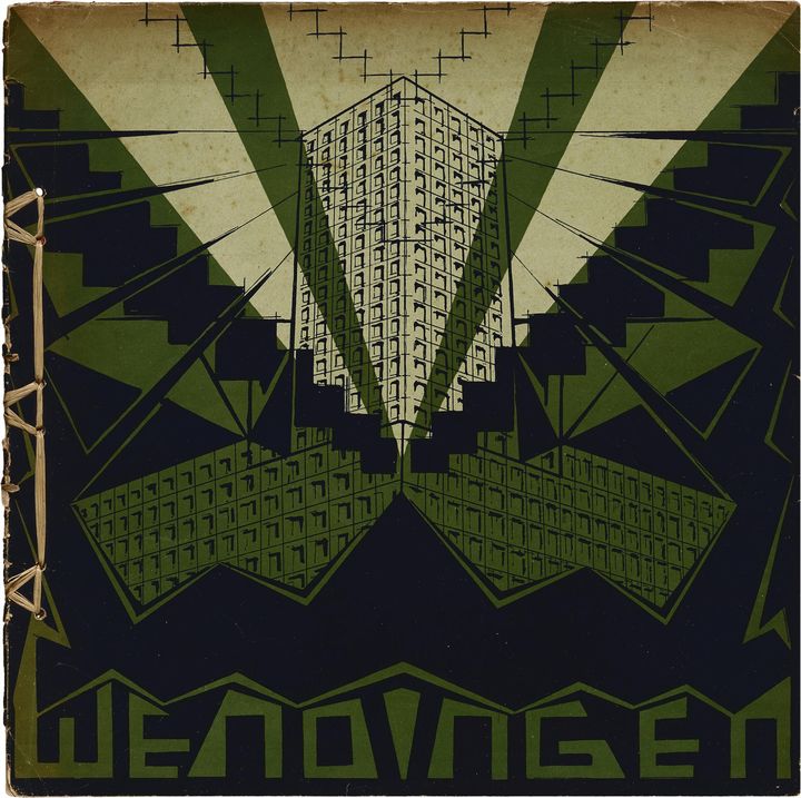
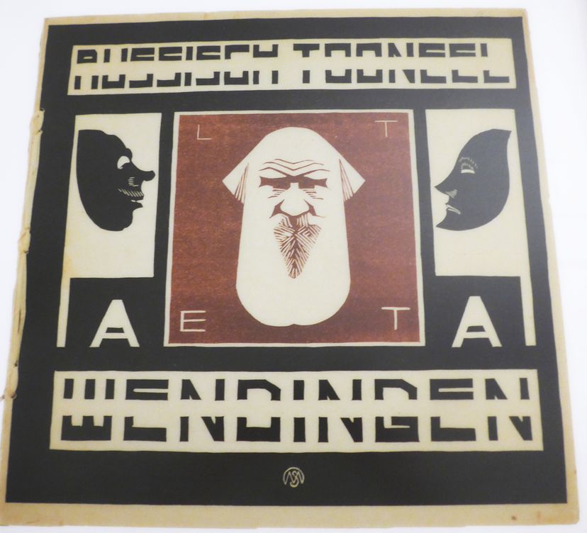
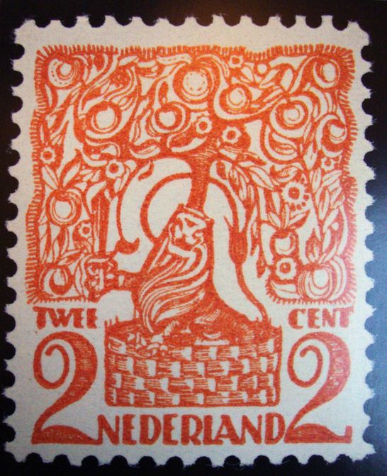
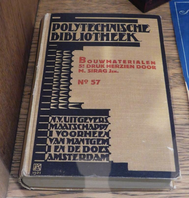
Magazine covers and books of the Amsterdam School. The stamp was designed by De Klerk.
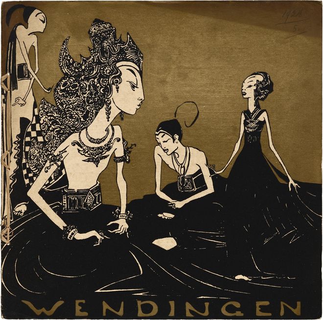
A wonderful temporary exhibtion documented the extensive influence of Indonesia, a former Dutch colony, on everything from graphic design, furniture and household items to architecture of the Amsterdam School. These few photos don’t do it justice.
1 – Cover of avant-garde architecture and design magazine depicting Indonesian shadow puppets
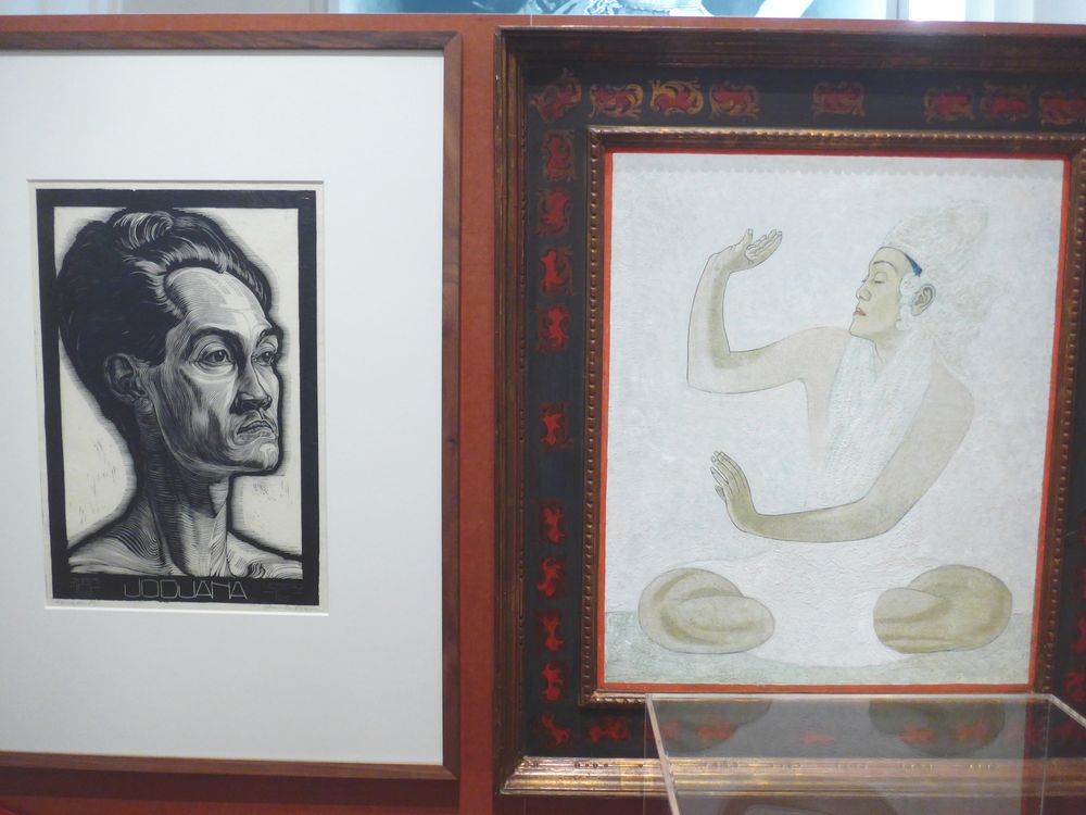
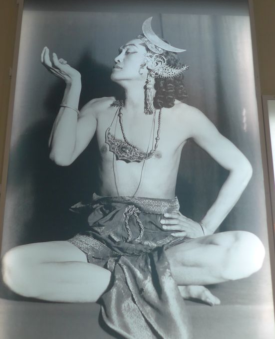
2,3 – Drawings and photo of Raden Mas Jodjana, a Javanese dancer who was renowned and popular in Europe and among the first to permanently settle there, and was often a model and muse for artists, c. 1920, providing context on the popularity of Indonesian culture in the Netherlands at the time.
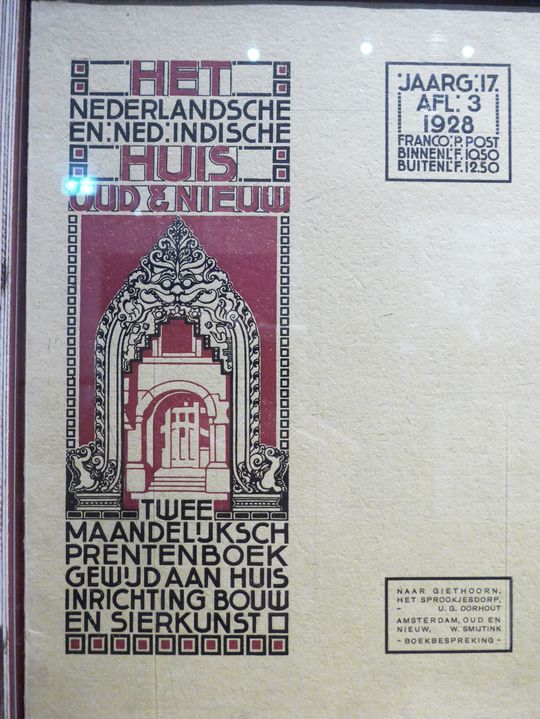
4 – Magazine about “Dutch and Dutch-Indian” [i.e. Indonesian] architecture, 1928