Whatever happend to colors?
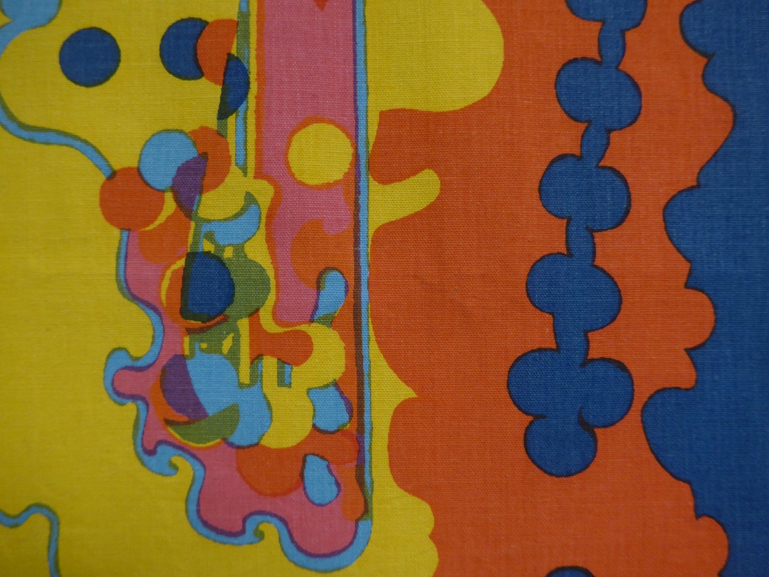
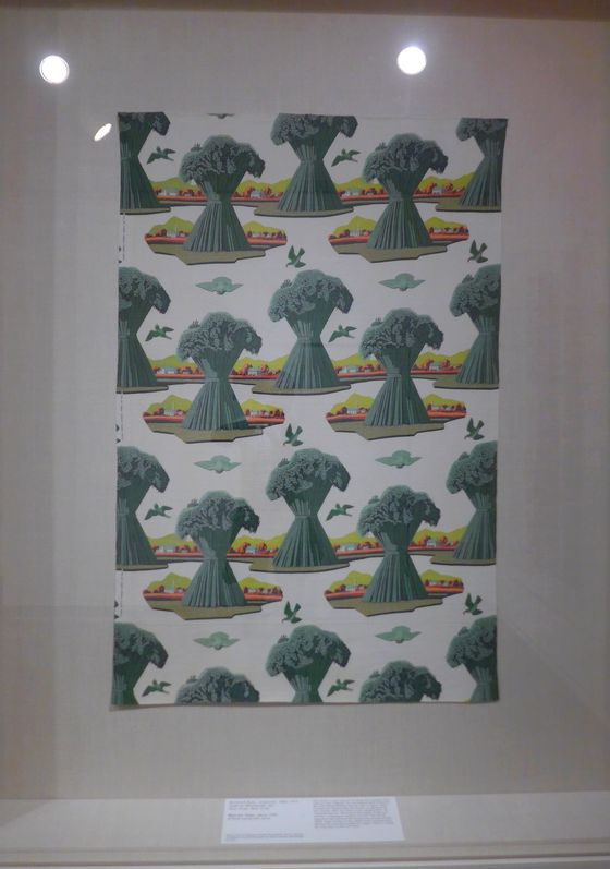
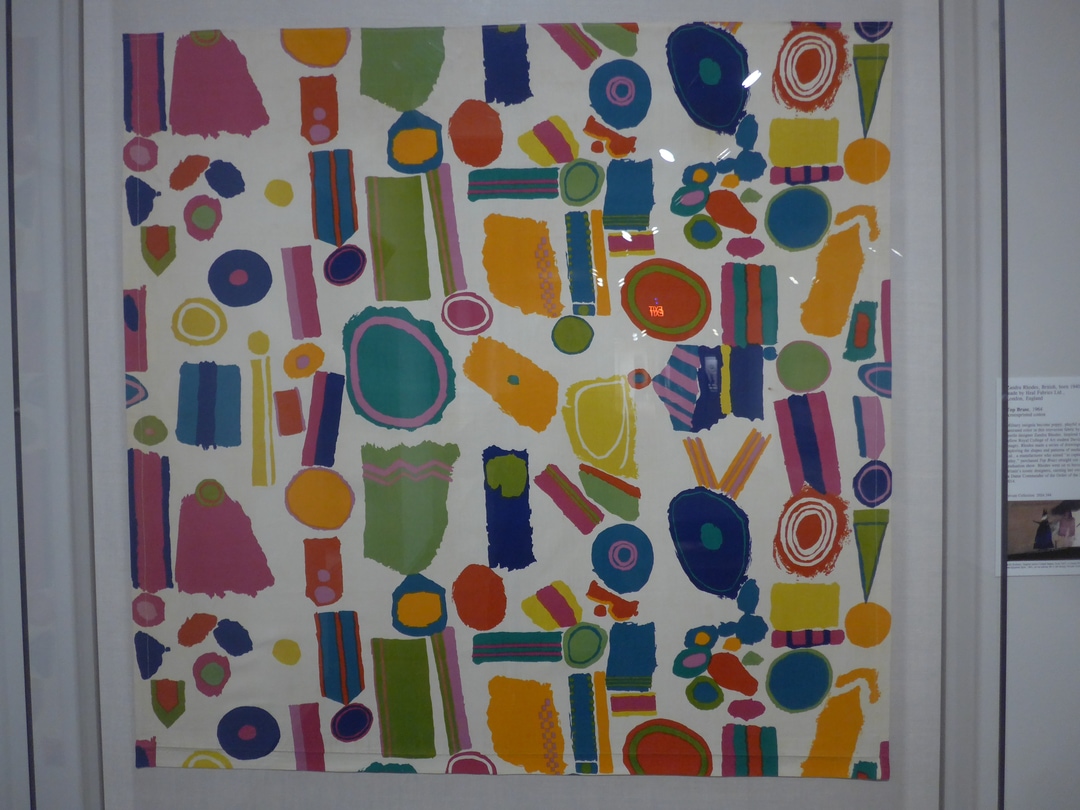
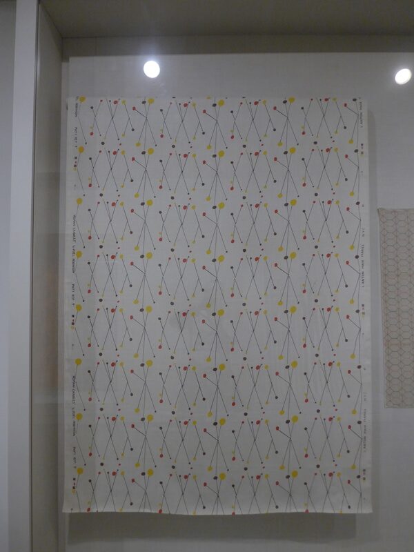
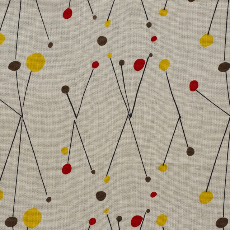
The St. Louis Art Museum only has one small gallery for textiles but its exhibitions are always miniature showstoppers. This one was on commercial fabrics which is a topic you rarely see even in design museums. The focus was on the U.S., U.K. and Italy 1940 to 1970 and it really showed how little flair we have around us nowadays. There’s multiple photos because I really need you to see the patterns as a whole as well as close up so you can see the texture. Otherwise it’s like watching a TV from across the street!
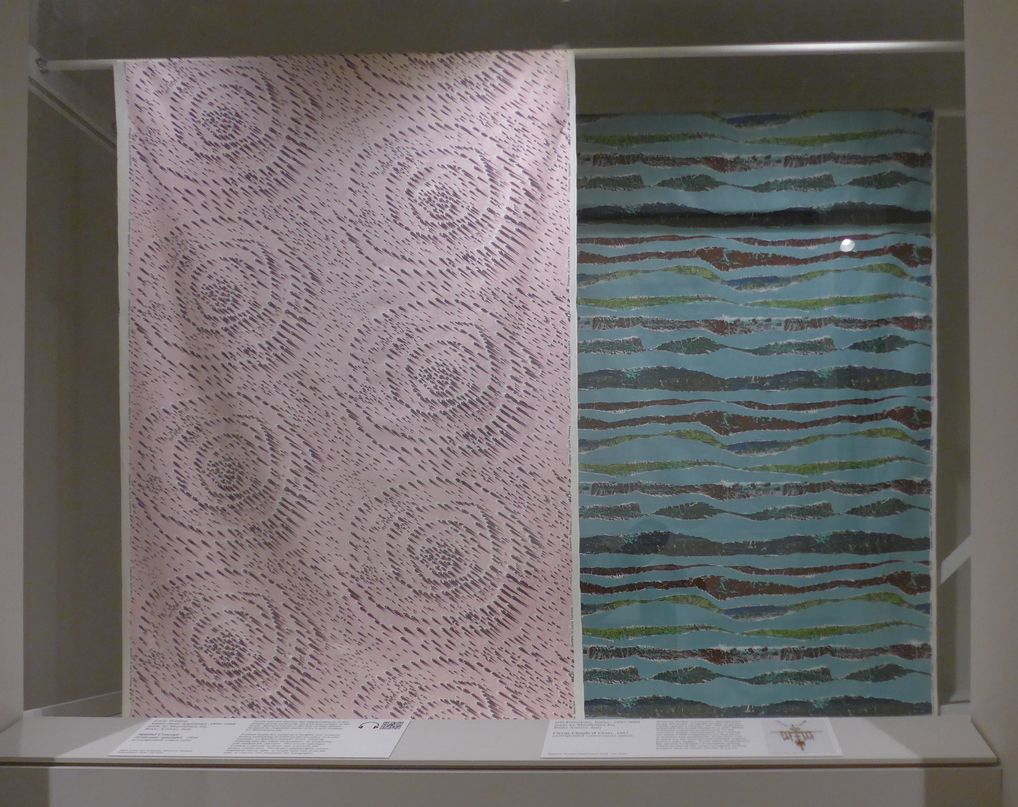
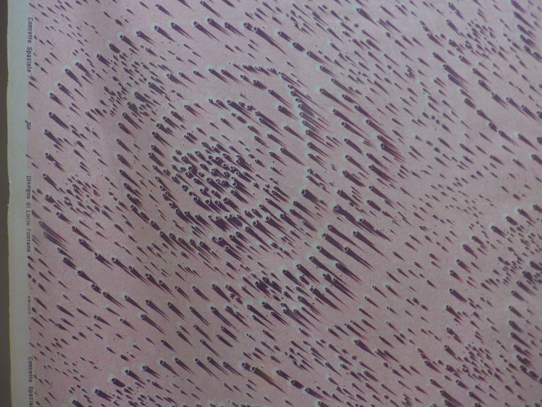
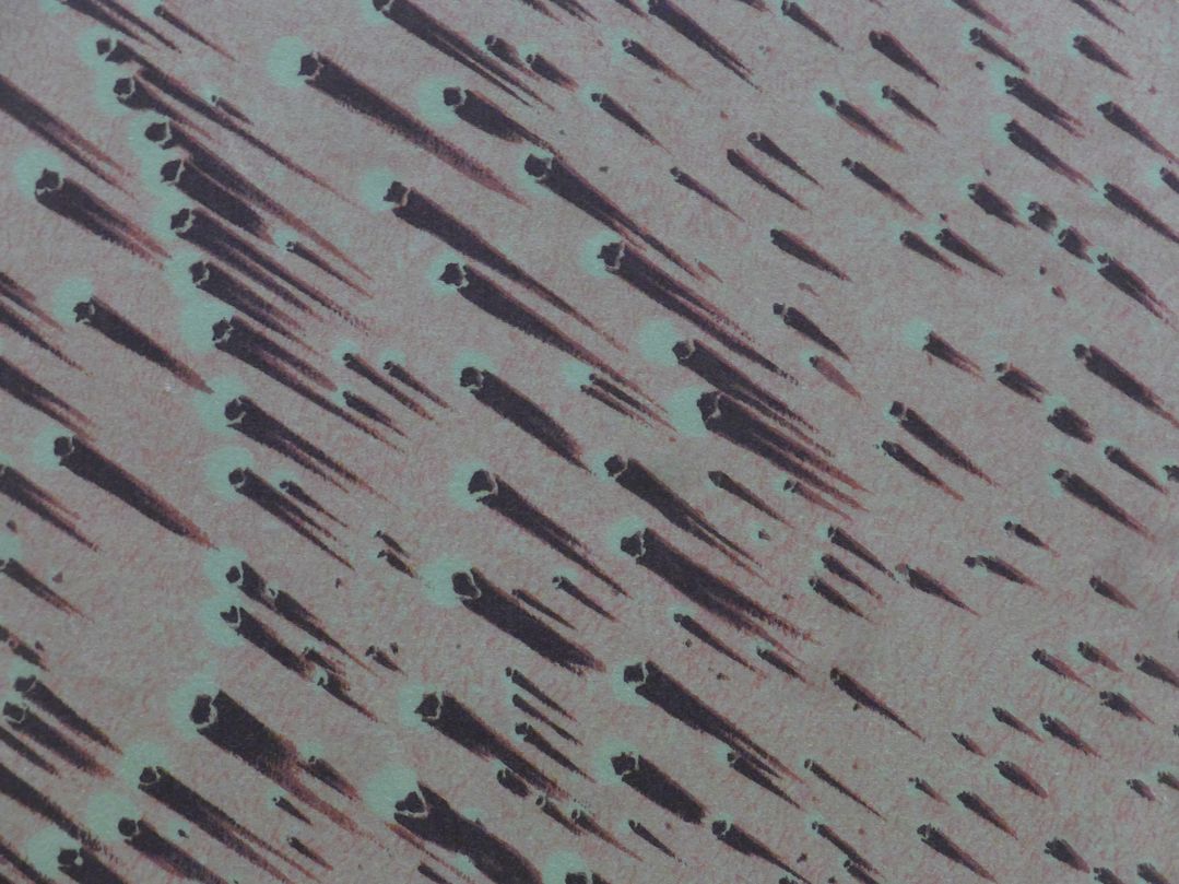
On the left is a pattern from 1954 called Concetto spaziale (Spacial concept) by the artist Lucio Fontana who’s known for distorting and slicing canvases rather than just painting them. The raised texture is an illusion on plain flat cotton printed with an ethereal pastel pink and murky dull eggplant. The design on the right was the winner of a competition in Italy in 1957 that got five thousand submissions.
Click to enlarge photos
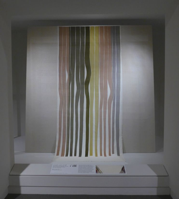
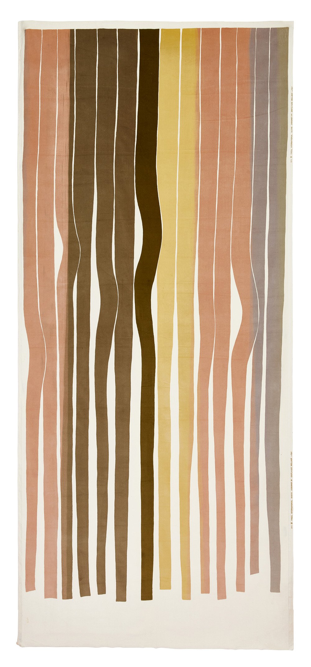
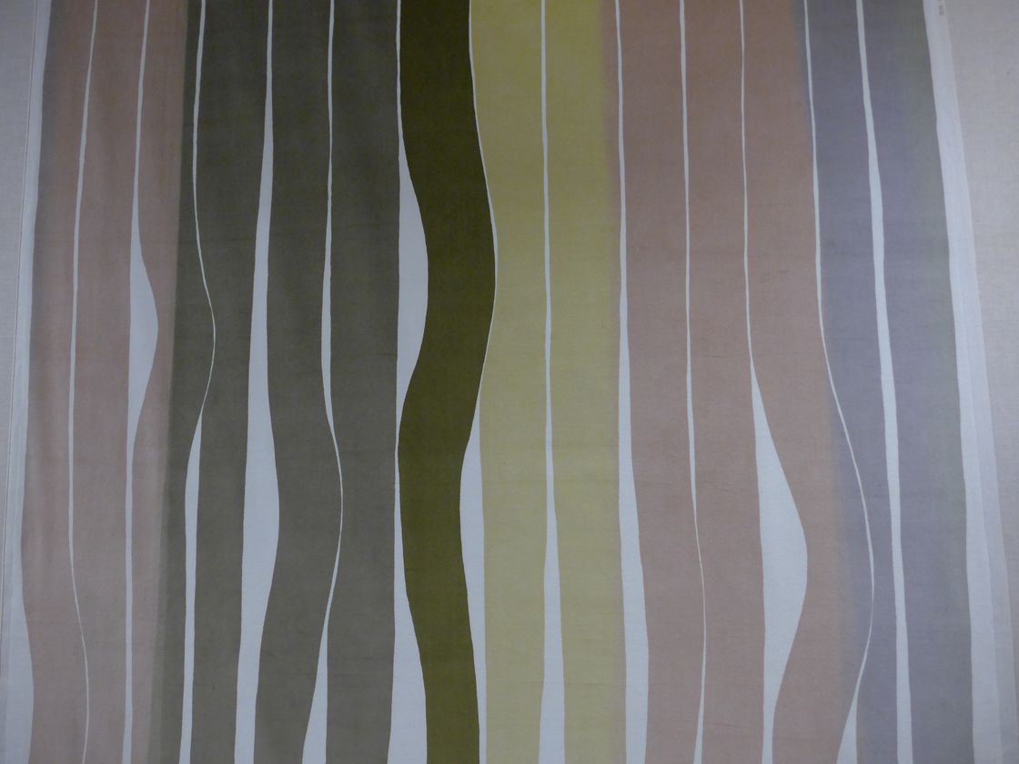
This oversized pattern called Rivers was in a 1972 collection called Three Meters, which is the size of the prints (ten feet; pattern repeats today range from a few inches to foot or at the most three feet). It required exceptional skill to produce and was intended as a tour de force for showing off a German textile company’s technical prowess. It’s silkscreened on velvet, the screens required four people to manipulate, and inks were blended during the printing process which is normally only done by artists making silkscreened artworks and even then is uncommon.
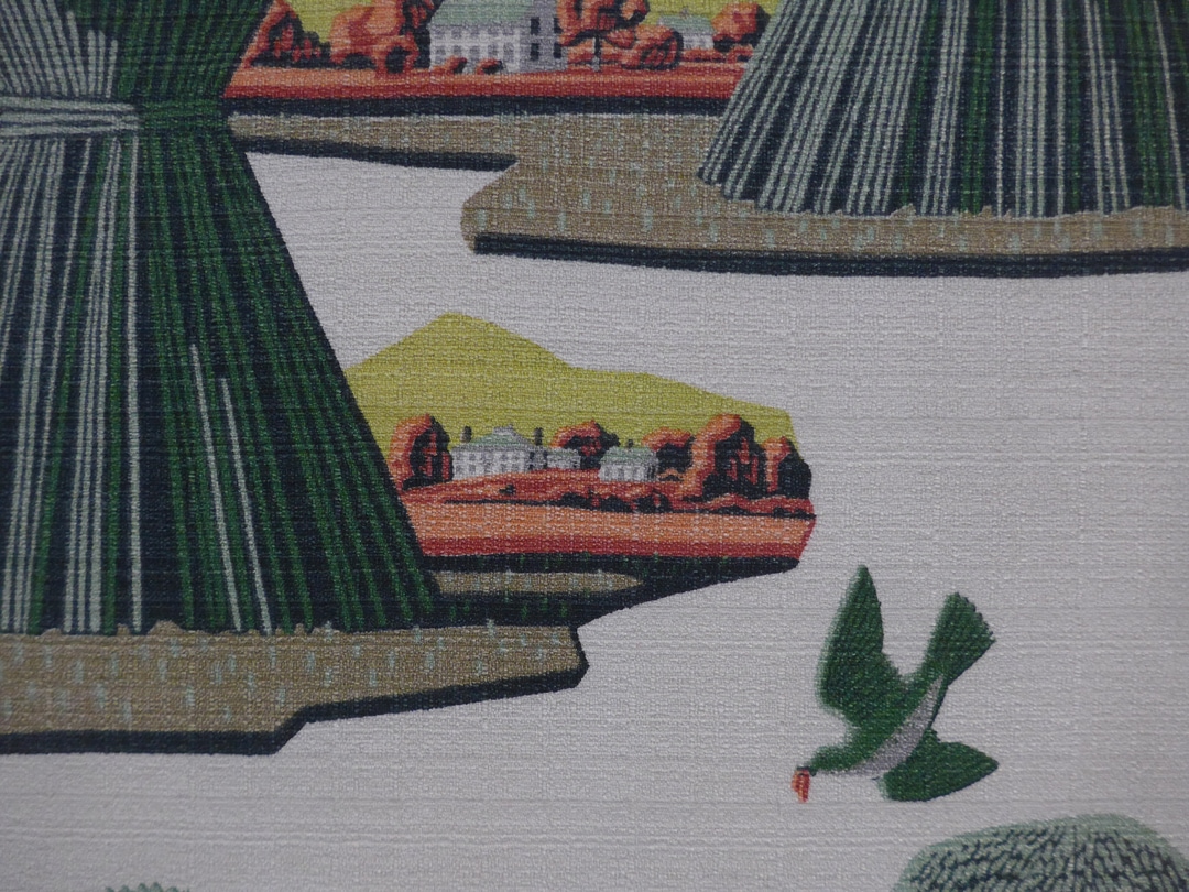
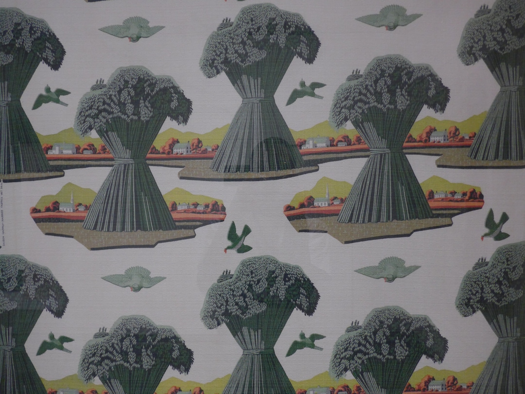
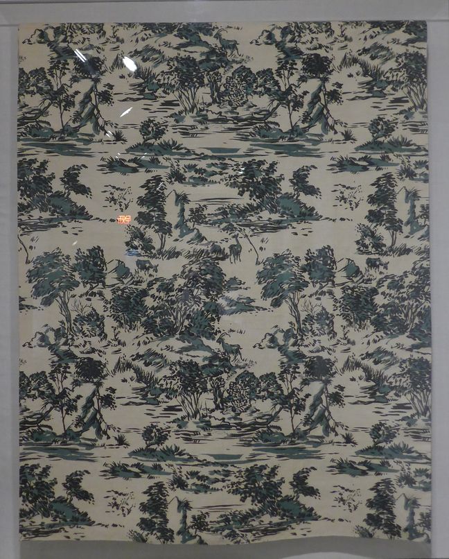
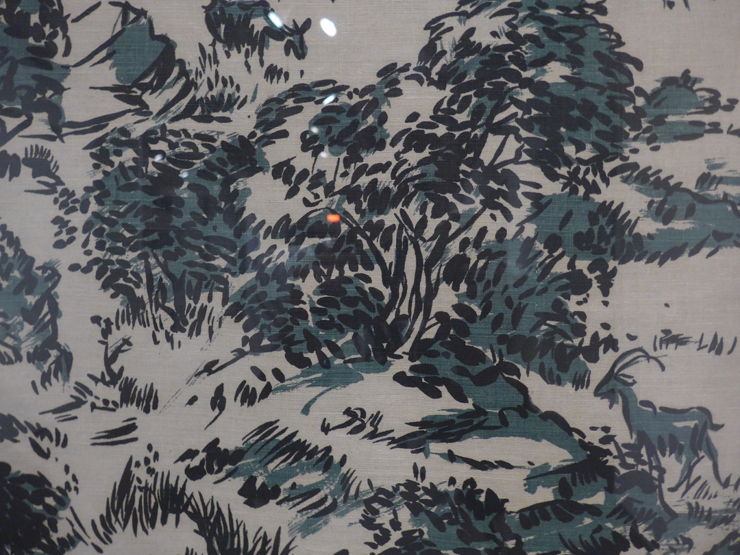
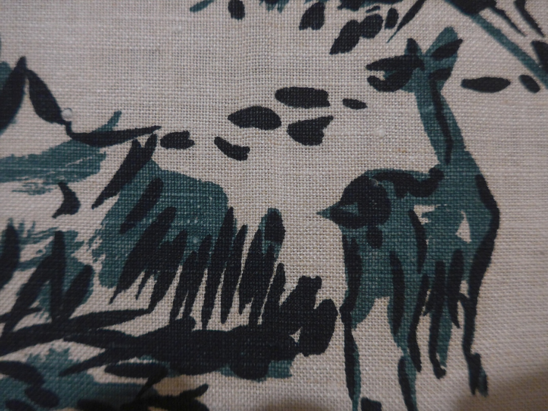
This one (Italy, 1948) suddenly made me think, out of hundreds of landscape paintings I’ve seen from four centuries, how many of them conveyed that the wind was blowing and the leaves were fluttering? As opposed to capturing a mood or single moment? For all their greatness I don’t think you can say that of the Impressionists.
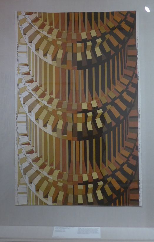
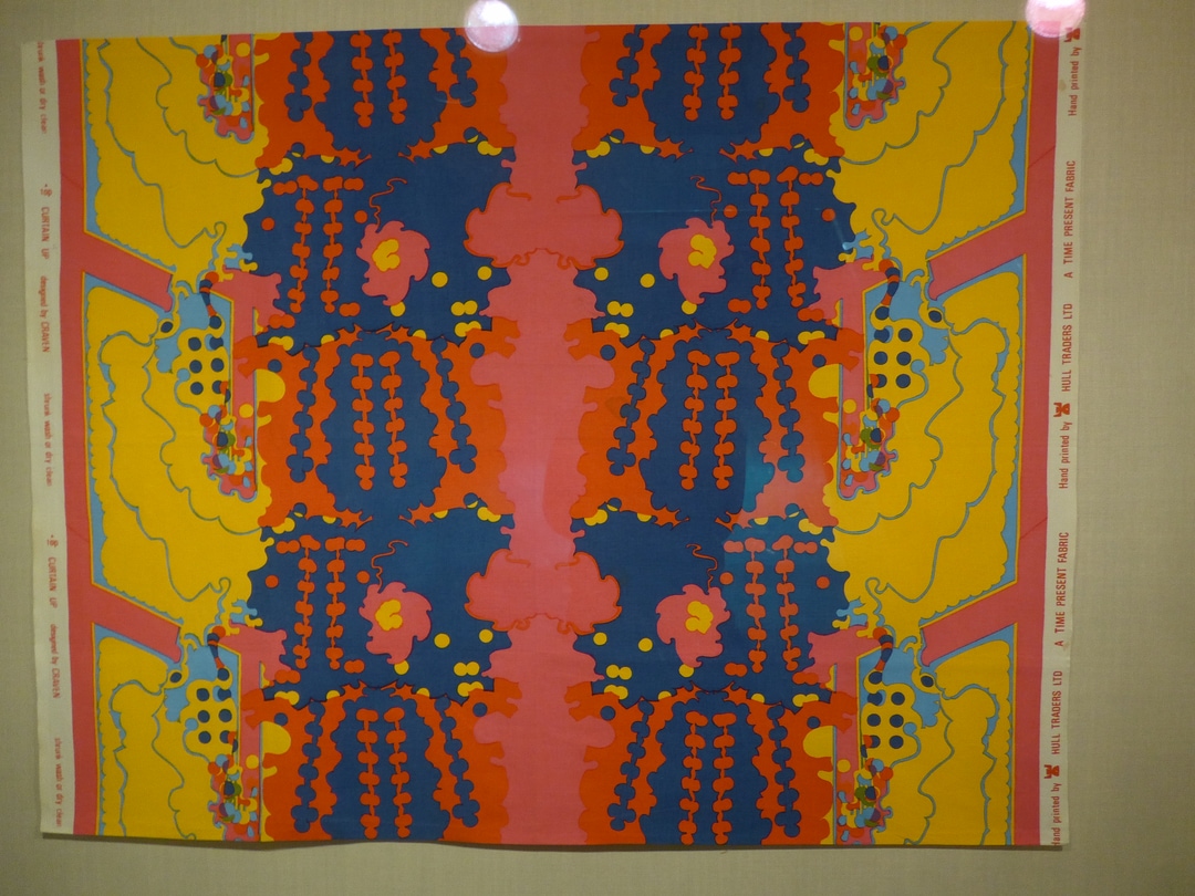
Another very large pattern and a slightly less large one; both are from Britain from 1970.